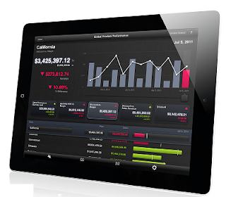
Roambi is becoming a tool for creating cool, interactive data visualizations or real-time business intelligence reports which your boss or colleagues will read on their iPad/iPhone anytime anywhere, in this blog we will show you how to create your very first biz interactive report on Roambi.
There are three different versions of Roambi analytics: Lite, PRO and ES4. like many other iOS apps, Lite is free to use; PRO is mainly for SMEs and ES4 is for corporates. In this blog, to make you easily understand and make a practice, we will take Lite version as example, it will give you the possibility to upload excel file to create your own dashboards reports. PRO and ES4 are for SMEs and Corporate which will give you much more power to work with real time data which will come from ERP system but they are chargeable, we will talk it about in future.
So first step is to create an account at Roambi website, if you have your Gmail account, that would be easy as you can use your Gmail account to log in. Meanwhile you can download Roambi free app from Apple store to your iPhone/iPad.
Ok now your account is created, lets get to work, first select the dashboard you want to create at the site, there are 5 different dashboards can be selected now.
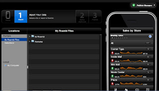
In this case if we want to create the catalist dashboard, and next steps is to import our data, we can upload a excel sheet here:
We now have to map the data so Roambi can understands it, we select rows,columns regions and data:
We now have data in our application, as this spreadsheet is about business planning, so it shows values as Budget, Actual and Last Year.
We could publish our app now, but i want to refine my dashboard some bit, with the refinement we can finetune how we would like to show our data. We can select different kind of charts we would like to show our data, for example bar, line or pie..
So now we can run Roambi App to check it out on our iPhone/iPad now, you can move your fingers to see the interactive report.
| iPhone view |
| iPhone View |
| iPad View |
Comparing with many other popular iOS apps , the business apps in these days still need to be improved in term of design, speed and interactivity, and there are a couple things you will realize when you use Roambi :
- To create a beautiful, drilled up/down interface, data mapping is important and the spreadsheet structure has to be well defined with multiple layers.
- To create best, easy to use interface, visualization has to be defined in advance, meaning, whatever it shows as bars, pies or lines, you can't change unless you change original data.
- This report dimension is limited to the parameters you defined in the document, which means you could not get more dimensions on the dashboard unless you add them into you original document.
Blog by C. Yang


No comments:
Post a Comment